Link to the video: https://www.youtube.com/watch?v=LawX4dn6k4U
In this video it displays the idea of her friends not telling her that the use of drugs 'Heroin' in particular, about the bad effects and show's how she's now addicted to heroine because she's now dependent on the drug making her feel better, and that it's the only thing that will make her feel happy.
The imagery of this video shows a dark,dingy,empty, which is interesting because it show's by her facial expression and her stance the way she's feeling from heroine to.
The message of this short movie, is to tell the audience how "herroin' and drugs overall can completely change you're life, health, looks and confidents and depicts 'heroine' as a bad drug.
From this video, we then had to create a leaflet which related to the video in sense of the message which the short clip was trying to promote.
To begin the research process I began by looking at other leaflets that were currently out there at the moment to gain knowledge of what imagery was used and what context was used in the leaflets, and other medias.
 \
\
This is one of the leaflet designs which i found online on the website bechance, it's design considering it's talking about cannabis uses the colour green as the main base colour which relates to the drug, what i've also noticed is the particular colour green of choice is dark and dingy so it doesn't make the audience look at it and think it's a achievement to go for. However the imagery is still engaging as it's modern so will attract adolescents to read. Although this design isn't satisfying due to the layout lacking in adventure, the use of colour and imagery communicates well to the topic.
The content of this leaflet seem's to depict on areas such as; risks and effects of taking cannabis, which is particularly limited, however we've got to remember that adolescent will not read pages of text and still be interested. Noticing how the leaflet doesn't promote any positives about the use of cannbis is highlighting an idea which I should bring through to my own leaflet design, although it does advertise drug service's to help with an issue or problem someone may have with drugs, which I will also take into consideration.

This image above which is of a poster which i found on behnance compared to the leaflet above communicates better due to the horrific imagery used, this gives reader a negative and sickness feeling, which is the feeling you should have when you're thinking of trying drugs or think of drugs. The use of the orange colour is almost like the warning colours; red and yellow, if you research vomit colours you'll find orange is the often colour when vomiting after taking drugs. This poster overall has an uncomfortable feeling due to the type being different sizes and some of the type deteriorating which relates to the effects of taking drugs.
Due to the media being a poster I think the little amount of text works well as when you see a poster on a wall if it's got to much writing on it no-one will stand and read it. However I believe that the body of text should be larger as then it would be more eye catching to read, the colour for the body of text should also be changed as white on orange when the text is small can be restraining on the public eye. Overall this poster promotes drugs as a bad thing and we clearly see this by the use of; text, colour , and imagery.
From gathering this information from these leaflets I then began to search information about all the different types of drugs, effects and what they can cause for someones future.

Alcohol – Booze, Bevvies
Young people are usually aged between 13-14 when they have their first alcoholic drink without their parents' knowledge.
- Effects - after a couple of drinks people can feel relaxed and less reserved. A few more drinks can make someone more talkative, cause their speech to become slurred and make them physically uncoordinated.
- Problems - alcohol can become dangerous in large quantities. Long-term drinking can cause physical and mental damage. Being drunk can cause people to become more vulnerable to violence, theft and assault.
- The law - at 18 it is legal to be sold alcohol.
Amphetamines - Speed, Billy, Whiz, Phet
Young people may use amphetamines at clubs and parties or at exam times and situations where they want more energy.
- Effects - the drug makes users feel energised and excited. It also suppresses the appetite therefore people use it to help with dieting.
- Problems - after effects can include mood swings, difficulty sleeping, tiredness, low energy levels. Long term usage can cause the user to feel depressed and paranoid.
- The law - Class B drug possession means up to five years prison plus a fine. Supplying means maximum 14 years imprisonment and a fine
Cannabis - Dope, Hash, Weed, Pot, Skunk, Ganga, Zoot, Spliff, Green
This is sold as a hard or crumbly resin or as a dry herb. Buds of the cannabis plant contain more drug than the stalks and leaves. Is it usually smoked with tobacco in a roll up. There are lots of different types of cannabis, including Skunk, Sensimilia, Purple Haze, etc.
- Effects - users feel relaxed, giggly and talkative.
- Problems - can feel anxious, paranoid and forgetful.
- The law - Class B drug possession means up to five years prison plus a fine supplying means maximum 14 years imprisonment and a fine
Cocaine and Crack - Coke, Charlie, White, Snow, Sniff, White Lady
Cocaine is bought as a white powder. It is normally sniffed but can be prepared for injection. Crack comes in the form of 'small rocks' and can be smoked and injected.
- Effects - users feel confident and strong.
- Problems - users become dependent on the drug and find themselves running into crime and violence due to the high price of it.
- The law - Class A drugs possession means up to seven years in prison and a fine supplying can mean life imprisonment and a fine
Ecstasy - E, Beans, Pills, Doves, Apples
Ecstasy is common on the club scene.
- Effects - energy, followed by calmness.
- Problems - some people suffer from sickness and experience stiffening of arms and legs and in particular their jaw. Ecstasy-related deaths seem to be due to heatstroke from overheating in a club atmosphere as ecstasy can dehydrate the body, drinking too much fluid and high blood pressure.
- The law - Class A drug possession means up to seven years in prison plus a fine supplying ecstasy can mean life imprisonment
GBL is a party drug which is particularly popular amongst university students, and can be fatal when taken with alcohol. It caused the death of 21 year old student Hester Stewart in Brighton in 2009.
- Effects - GBL has the same effects as GHB – which is also classified as a Class C drug and known as ‘liquid ecstasy’. Produces feelings of euphoria, reduce inhibitions and cause sleepiness.
- Problems - potentially serious consequences when taken with alcohol or other depressant or sedatuve drugs.
- The law - GBL was made illegal in December 2009. It is now classified as a Class C drug under the Misuse of Drugs act 1971. Anyone caught with this drug can get up to two years in prison or an unlimited fine.
Heroin - Smack, Junk, H, Brown, Gear, Skag
Comes as a white, greyish or brown powder. Often smoked it can also be injected or sniffed.
- Effects - reduces physical and emotional pain and gives warm, drowsy feeling to allow users to forget their problems.
- Problems - First time users are usually sick and it can take weeks/months to become 'hooked'. Overdosing on heroin is a major risk as street heroin is mixed with other substances. Overdose can mean falling into a coma or even death. Withdrawal symptoms can mean flu-like symptoms - sweating, shaking.
- The law - Class A drug possession means up to seven years in prison plus a fine supplying can mean life imprisonment and a fine
Ketamine - Green, K, Special K, Super K
Powerful anaesthetic drug with medical uses which is usually sold as a white crystalline powder or tablet.
- Effects - painkilling effects as well as altering perception. Low dose users might feel euphoric, and higher dose users might hallucinate.
- Problems - numbness and unexpected muscle movements as well as feeling sick. Large doses can lead to unconsciousness.
- The Law - Class C Drug possession can mean up to two years in prison and a fine supplying can mean 14 years imprisonment and a fine.
Khat - Qat, Quat, Chat
Khat is a leafy green plant and the leaves are chewed.
- Effects - similar effects to Speed, more talkative and more energy, appetite supressant.
- Problems - can lead to insomnia and confusion. High use can lead to high blood pressure and heart palpitations.
- The Law - Khat is now a class C drug which means that you can go to prison for two years for possession or much longer for dealing. It will also be an offence to bring Khat into the UK from other countries.
LSD - Acid, Tabs, Trips
Sold as small squares of paper with cartoon designs. These are swallowed and take up to half an hour to have an effect. A trip can last for as long as 12 hours.
- Effects - drug changes the way that users see and hear things. There is heightened self-awareness and users can hallucinate.
- Problems - 'bad trips' can be frightening. Users might feel anxious and accidents can occur when users are not in control of their faculties.
- The law - Khat is now controlled as a Class C drug under the Misuse of Drugs Act.
Magic Mushrooms - Shrooms, Mushies, Magics
Generally only available during the autumn in the wild. They can be eaten either raw or cooked, made into a tea or smoked. 20 mushrooms would be a usual dose.
- Effects - hallucination can occur. It takes around half hour to take effect and can last for as long as nine hours.
- Problems - picking a poisonous mushroom by mistake.
- The law - Class A drug possession can mean up to seven years in prison and a fine supplying can mean life imprisonment and a fine.
Mephedrone - Meow Meow, M-Cat, Drone, Bubbles, Bounce
Mephedrone (often called 'meow meow#) is a powerful stimulant and belongs to a group of drugs that are closely related to the amphetamines - including amphetamine itself (often called 'speed'), methamphetamine and ecstasy. There is very little evidence about mephedrone and what long-term effects it has, but there have reports of people hospitalised due to the short-term effects. Also, you can never be entirely sure that what you're buying is actually mephedrone and not something else.
- Effects - Euphoria, alertness and feelings of affection towards the people around you, anxiety and paranoia, can also overstimulate your heart and circulation; and can overstimulate your nervous system, with risk of seizures.
- Problems - Not enough long terms tests have been done. It is said to be highly addictive too. There were six deaths involving mephedrone reported in 2010 in England and Wales.
- The law - Mephedrone is a Class B drug, so it's illegal to have for yourself, give away or sell.
Tobacco - Ciggies, Fags, Tabs
5% of thirteen year olds smoke a cigarette or more a week. Around 1/3 of older teenagers smoke on average more than 10 cigarettes a day.
- Effects - first time smokers often feel sick and dizzy. One or two cigarettes increase pulse rate and blood pressure.
- Problems - users quickly become physically dependant on cigarettes. Long-term smoking can result in heart disease, blood clots, heart attacks and lung infections.
- The law - selling any tobacco products to anyone under 18 is illegal.
From this I learnt some interesting things; being caught with any type of drugs will never be a positive you always get fined or put into prison and that all these drugs have life threatening influences for the future.
From gathering an insite to what drugs can really do to you, I then began researching before and effect of the use of drugs to gain a knowledge of what some people actually look like from experiencing taking any type of drugs, these are some of the images I found;


These are only some of the images which I found online of people who have experience the before and after effects of drugs. It's sad to think that people are dependent on drugs and don't realise how the effects of taking drugs can make you look like not only will it effect yourself confidence, it'll give major anxiety and depression. what I've found searching this imagery is that there is no positive effect's from taking illegal drugs and there's never happiness in reality taking them. An idea for my leaflet would be to incorporate some of the imagery to make my audience understand some of the consequences of taking drugs, and hopefully the use of this imagery as it's displeasing to the the eye, will put them off trying any type of drugs.
From finding this destroying imagery I then thought it would be an idea to research the physical pain and the emotional pain that would make someone want to take drugs. Was it peer pressure? Was it family or friends influence's?


From researching I found a book on google books which talks in depth about peer-presure and drugs and the influences in peoples life, I also found some information about drug rape and how people drug drinks in a bar or club to make a women or man feel venerable. This information will be useful to include in my leaflet design to aware adolescents the other dangers of drug use.
From this i then began to search celebrity influences and how they influence people today in taking drugs, as celebrities are a main source which adolescents look up to as there role model an interesting case is Amy Winehouse, as amy was brought up around drugs due to her brother being an addict and supplier at the time and influenced Amy from a young age, then in her later life ended up with a boyfriend who was a 'drug smule' who brought drugs to there house and they were around her all the time. It was known that her boyfriend Blake at the time was a heavy user of Herroine and at one time his mother claimed walking into the front room to find him swallowing bags of herroine and cocaine. However Amy did try to change her life after her following album with the famous song 'Rehab' among many others as she decided to change and asked her farther if he thought she needed to go to rehab and from fatherly advice he explained that he didn't think that she'd need to go but it would help if she did, however Amy did not want to go to rehab and wanted to try making herself better first and to do this she took sometime out of her music career to get better. Although sadly Amy passed away in 2011 due to alcohol intoxication. Amy's family and friends, said how Amy was always a giver and she'd always giver her money away to people that she thought needed it, and that wasn't always necessarily for good reasons. What's uplifting about this story is that she knew that she needed help curing herself from the bad habits she's been brought up around, although she decided this a little to late.
Amy was an inspiring artist to many adolescents and many people who have had trouble with drugs as her lyrics in her songs were graphic and realistic to how life was. Not only did her self image portray that she had put up with a lot of things in her life, her songs did to, they were full with meaning.
From this I thought it would be wise to research what happens to your eye sight when on drugs. I found that things such as; shaking,redness and hallucinations can often occur making you confused, sick,dizzy, and eyes saw. I was then beginning to think of ways i could create imagery that would make an image difficult to concentrate to look at or concentrate on, I began by searching scenography and optical allusions.


From researching these subjects such as scanography and optical allusions I found some interesting imagery, the use of scanning in type makes it difficult to read and you'd need to focus on the image deeply to understand what it was trying to communicate, the the image has been distorted on the David Carson image is interesting to the fact that it shows a number of personalities and shows a change in mood. The use of the scan brings out the tints of bright colours, which almost relates to the idea of taking drugs in a cub or bar which is where a lot of adolescents take drugs in this day and the colours brought out in the scan reflect the lighting of a nightclub or bar.
The optical illusions can relate to hallucinations when you're on drugs as it can make you feel closer to your surroundings or objects and can make you have so call 'Trip', it would be interesting to experiment with the use of illusions and type to make a person who doesn't take drugs who may be influenced realise what you're sight and eye could feel like on them, which is negative. Overall when it comes to experimentation I will experiment with these ideas.
From this I then began to think about what type of leaflet that I wanted to create: Mini newspaper, mini magazine, mini brochure, single sided leaflet, double sided leaflet.


This image below is of drugs which I was trying to change the image to make it look slightly modern, and I wanted to create a negative effect which is why the copied picture is overplayed with the word 'No' on it, I'm unsure with how I feel about this image, as I don't think its a visually attractive piece of design, in-terms of layout and the effect's used, I also don't think that it shows negativity in it's greatest way because of this, I will not be taking this into my final outcome. If I were to do this piece of design again I would use darker colours to influence the image and find a better way to display the word 'No'.


From researching these different type's of leaflets, I decided that it would be interesting to create a mini newspaper as a newspaper is in a way an awareness leaflet, because of the use of the headlines and storys which often appear in newspapers. For creating this I will make it modern and attractive to look at by using some unusual imagery but still keeping it grungy.
From this I then had to think of the different types of stock that I could use, I began this by looking in the art shop in Leeds College Of Art and looking at the stock they had.

The first material that I considered is newspaper paper. Newspaper paper you often find is Grey colour so it looks slightly dingy, which would connect with my topic 'Drugs' well as I'm trying to communicate a negative awareness. However Newspaper paper is thin and when I tried to fold 4 double page spreads I found that when you hold it, it's very fragile and almost felt like one piece of tissue paper, so from then I decided to find a thicker stock.
The stock which I focused on next is the one in the centre of the image which is slightly thicker. This is stock kept it's grungy look, It was just slightly darker, which adds a darker ambiance to my leaflet design. However I feel that the paper could do with being slightly lighter so that it didn't look to dull.
The next paper i choose to explore is a creme card, soon to realise that this stock would make my leaflet look more like a mini magazine/ newspaper. However I liked the brightness of the paper, on the inside of this paper was white, which i found was a positive because it'll make imagery more clear , but a negative being that it would look less like a newspaper design.
During my experimentation I will experiment with the second and third stock to see which I prefer best and which one will fit my topic and colour scheme.
From this I then began to research negative colour schemes, negative colours are shades such as; Black, Grey, dark greens, Dark blues, Dark purples and there are also warning colours such as red and yellow which a brighter but are used because they are eye catching.

If you look the the right of this colour wheel you will find negative colours such as blues, as they give a feeling of coldness. However because I want my imagery to be a main focus in my newspaper/magazine i will be using subtle colours and may even use slightly positive colours just to make it more visually attractive.
From this I then looked at packaging for leaflets and binding as leaflets normally are posted through the door, so it's important to have an interesting packaging or binding method to make someone want to pick it up.


From this the idea's which I like the most, is the stitching idea to bind my leaflet together as it connects to my leaflet because the word 'Stitch' often relates to fixing things which would relate well to my topic. I've also that in terms of packaging that a suitable packaging would be a poster tube, as it will be eye catching when received. What will be difficult is to find one which will fit through a letterbox, although I will try my best.
From this I then began to sketch layout ideas for my newspaper idea; from my research I discovered that i wanted the context to be quite informative and the imagery to be graphic and difficult to concentrate to put adolescents off wanting to take drugs. The use of colour will also influence this idea I will keep the colour scheme simplistic and use darker colours to influence the imagery, although using some fairly happier colours to enhance it's attractive appeal.


From these sketches I then began to experiment with image making using the scanning machine:

This is some image manipulation that i created using photoshop and the scanner machine, i wanted to distort Amy Winehouse to show how when your on drugs, the ways you're vision could change, and I choose Amy as Amy had a big influence from drugs in her life and is an iconic example in why not to take drugs. In particular the image i prefer the most would be the image in the second row in the middle as, I feel it's manipulated the most successfully as you can still see her face, and it brings out some brighter colours in the imagery which is subtle which is what I originally wanted.
Furthering this experimentation I began to overlay the imagery with colour to brighten the imagery up even more, to make it look more appealing and eye catching to an adolescent reader and adolescnent's are attracted to brighter colours. However I do find some of these below experiments appealing I think the images on the left hand side work the best and might take one of these in to developing my newspaper/magazine idea.


This image above is some of the imagery of the scenography which I created above which I over-laid some of the imagery to give this effect, this adds texture and appeal to an audiences eye. The use of the colours which have been stretched out using the scanner machine make the image subtle colour stand out. The scan itself works well as it makes Amy's face look even more distorted which adds to the effect of someone on drugs and th effect's that it can cause. This piece works well as design and will be brought into my final design, possibly on my front cover. If i did this piece again I would possibly try do a screen print of the scanned image as it would look visually interesting to the audience and add texture.
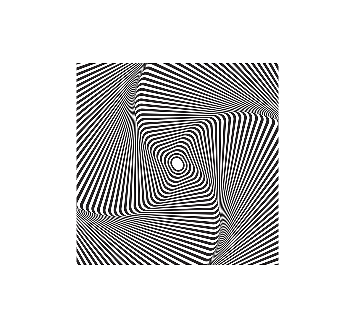
I then began creating optical illusions, changing the opacity of the text and rectangular lines, moving the lines closer together to make it difficult to look at. Optical illusions relate to my subject matter as it relates to the vision effects of taking drugs as your eyes; shake, have redness, hallucinate, and optical illusions show how things look like there moving (coming closer or further away) when there not.
I created this Idea using photoshop using circular shapes to create this moving image effect, I also then cut circle shapes over the top of it to make you're eyes try to focus into the middle of the illusion. This piece of design I feel is successful as it does make your eyes un-easy with the use of lines and circler effects, I will be bringing this idea into my final outcome. If I were to do this piece of experimentation again I would use circles instead of squares as it will bring the eye more into the middle of the illusions and impact on the eyes more.

‹

From this I then started to put imagery together that was graphic to the content that it would make adolescents not want to be apart of taking drugs.
For this image I wanted to make it look negative although the imagery which has been used is already grungy and negative, I wanted to enhance the idea to do this; I layed a black rectangular box over the top and changed the opacity over it to give this black and white effect which works well. This shows the darkness of taking drugs and the imagery and the use of the darkness shows it's negativity, i will use this imagery when it comes to my final outcome. If i were to do this again, I may have distorted some of the imagery to make it relate even more to my subject.

This image below is of drugs which I was trying to change the image to make it look slightly modern, and I wanted to create a negative effect which is why the copied picture is overplayed with the word 'No' on it, I'm unsure with how I feel about this image, as I don't think its a visually attractive piece of design, in-terms of layout and the effect's used, I also don't think that it shows negativity in it's greatest way because of this, I will not be taking this into my final outcome. If I were to do this piece of design again I would use darker colours to influence the image and find a better way to display the word 'No'.

From having a failure for my previous experimentation, i then began to think of way's in which I could incorporate the work no with the use of drugs. So I used an image of drugs and used a red rectangular overlay this time with a 'Multiplay' effect of it, which worked effectively, then placed the word no with the bebas neue letter as the text is bold and stands out as I want my audience to notice the text. The colour red used is a warning colour so when the audience looks eat it then will immediately know that it's a negative image. However looking through my past ideas and experimentation I feel that the flow of imagery need's to be similar and in my designs I haven't used bright, so It would suit being in my final outcome. If i were to do this again then I would make the colour less bright and find different positions to place the text 'no'.

For the next part of my experimentaion I began experiment with type and how I could use type to influence my topic.
This experimentation below of 'Drugs' type I manipulated by using illustrators warp tools, to enhance the idea of someones vision when they are on drugs, in how they see things. I was unsure the use of the mint green round the sides, the reason for the choice was because I felt like it was a cold colour which would create a cold feeling. Although I also think that this colour also looks quite friendly due the colour being a postal colour, In terms of the type itself I enjoy the look of it, however I was unsure if it looked childish and didn't know if it would be to bold to put in a newspaper/magazine, so I will not be taking this through to my final leaflet. However if I were to do this again I would make the type similar and take the border away from it.

This image of type below is something which i created using indesign, for this design I wanted to focus on the type for the front page. I wanted the text simplistic and the colour neutral, this choice of colour I believe works well as it almost looks like skin and if you look closely it has a few marks on it which relates to drug abuse and the use of needles which leaves mark on you're arms. The choice of this particular font Beabs Neu is because of it's bold appearance and it's also quite a modern font today and the target audience is for adolescents so I believe it will attract them. This piece of design works well as it communicates to my topic, so I will be using this when it comes to my final outcome. If I were to do this again I would concentrate on the background of the pink and make it look more wearing.

I then Began to take my designs on to indesign to start creating the layout for my leaflet (the numbers will not be included and are not currently in the right order). Overall I'm pleased with my design idea, however I may work on reducing the amount of text as Im aware as my audience will now be interested in reading pages of information. However I think that this design communicates well due to the imagery and the large text, from designing this I will then begin the printing process.


This is the final print out leaflet, which I'm pleased with, as I experimented printing on two different materials and found that both looked good, so I've took the opportunity of combing both materials into one design. These images below are of my fished project. To further this project I will combine with fashion to get my leaflet binded by stitching. This leaflet works well due to the imagery of optical allusions, modern type choice and scenography and distorted as it relates to being involved in drugs and the effect's that it may give, the font choice was chosen to be bold and stand out as the headlines were important to see and the Babas Kai font, is modern so will attract adolescents. However if I were to do this project again, I will use less text in my context as, people don't often enjoy reading full pages of text especially adolescents as they loose concentration, although the use of the drop caps can make your eye more interested as it distracts you from the paragraphs for a period of time and it's interesting to look at.


Following on from this I decided to create a packaging for my leaflet, as when leaflets are delivered we often find that people don't look at them and put them in the bin, however my leaflet being in a poster tube not only protects it but it will be a noticeable item when delivered through the door. This poster tube will have associate wrapped round it with this following pattern on it to not only keep it waterproof but to make it visually attractive. The idea behind this poster tube was to make it something that the post man could through on a garden and leave it on a front door, or even post it through there letter box. However I ordered two poster tubes, but the ones that I wanted were not in stock as they were made of letter box postage, the ones which I purchased are slightly bigger just to show the idea I've created.


During the design period we had an interim crit which I wasn't able to be there for so i organised my own private one in my flat these were the comments: Brilliant optical allusions, lovely front cover, try use less text, love the distorted Amy image. Overall I am happy with the comments as most were positive and I also agree with the negative comments as it's something I completely forgot about however I will take these comments into mind following my next project.