LIVE BRIEF: SECRET 7”
Chvrches - Clearest Blue
For this brief I wanted to create an album cover that used more of a practical experimentation method such as scanography & illustration, as I felt that to be in chance of winning I'd have to create something fairly abstract and different as i felt that there would be many digital created submissions so therefore creating more of a practical solution I thought I would be in for a bigger chance of winning.
For my research I first began by researching the song itself first listening to the sounds of the song to try get a feel what song genre it was going to be, from this I felt that the song was electronic/pop song which would be played at a festival, I also felt that the song gave feminine vibes I think this is due to the delicate tone of the singers voice and the choice of melody of the song.
From this I then began to analyse the song lyrics thinking about what the song was about and the mood that it gave off. The song itself seems upbeat yet some of the lyrics contradict the song as it comes of as sad and happy such as ' If I ever tried to push you away' & also the word 'Blue' which we associate with feeling sad, however the word 'clearest' also gives the song more of a positive vibe and the word is often used in a positive way.
Because of my initial findings such as the song giving a festival feminine feel & also a negative & positive feel. I felt that I could use the idea of flowers and experiment with scenography as i could create something psychedelic which would link to the electronic feel of the song, this would also make the album look less feminine and be more unisex. The use of the flowers would also give the feel of a festival, and then I may use the colour blue to influence the colour choice when it comes to using flowers. I will also try creating some illustrations to show a delicate flower which will also show the delicacy of the singers voice.


[Verse 2]
[Build Up]
[Outro]
Shaped by, clearest blue
Shaped by, clearest blue
Shaped (will you keep it half-a-way)
By, clearest blue (will you keep it half-a-way)
Shaped (will you keep it half-a-way)
By, clearest blue (will you keep it half-a-way)
From this I then began to research there previous albums to get a feel for the types of media the artists went for, what I found is that the method they seem to use looks like screen print which is a practical method which works well. The albums also looked fairly modern and pop themed due the simplicity of the designs.


I then decided to research the current album cover for the song 'Clearest blue' and found that they used flowers & clouds in there designs but they also combined them with coloured squares which made the albums look more electronic. I do enjoy these designs however I feel that the electronic idea could be shown in a simpler way as I feel that albums like this have been created before & feel something different and more practical (like the other albums) would suit the song better.


From this I then began to sketch out a few ideas, using the ideas of flowers deciding how to use the flower and how much flower that I should use, i also wrote notes down to remind myself what feel the song gave off.

From this I then decided to buy some blue flowers to experiment with the idea of scanography I created this idea by using the flowers heads and moving them round the scanning machine, this method helps with the influence of an electronic feel as when you drag pertained coloured objects on the scanner it also shows different colour as it stretches the objects out.


From moving the flowers round I also decided to scanning in some still flowers to see the effect it would give I found that this method didn't communicate as well as it had no electronic movement feel to it and it also looked quite girly when i'm trying to make the album cover look more unisex.


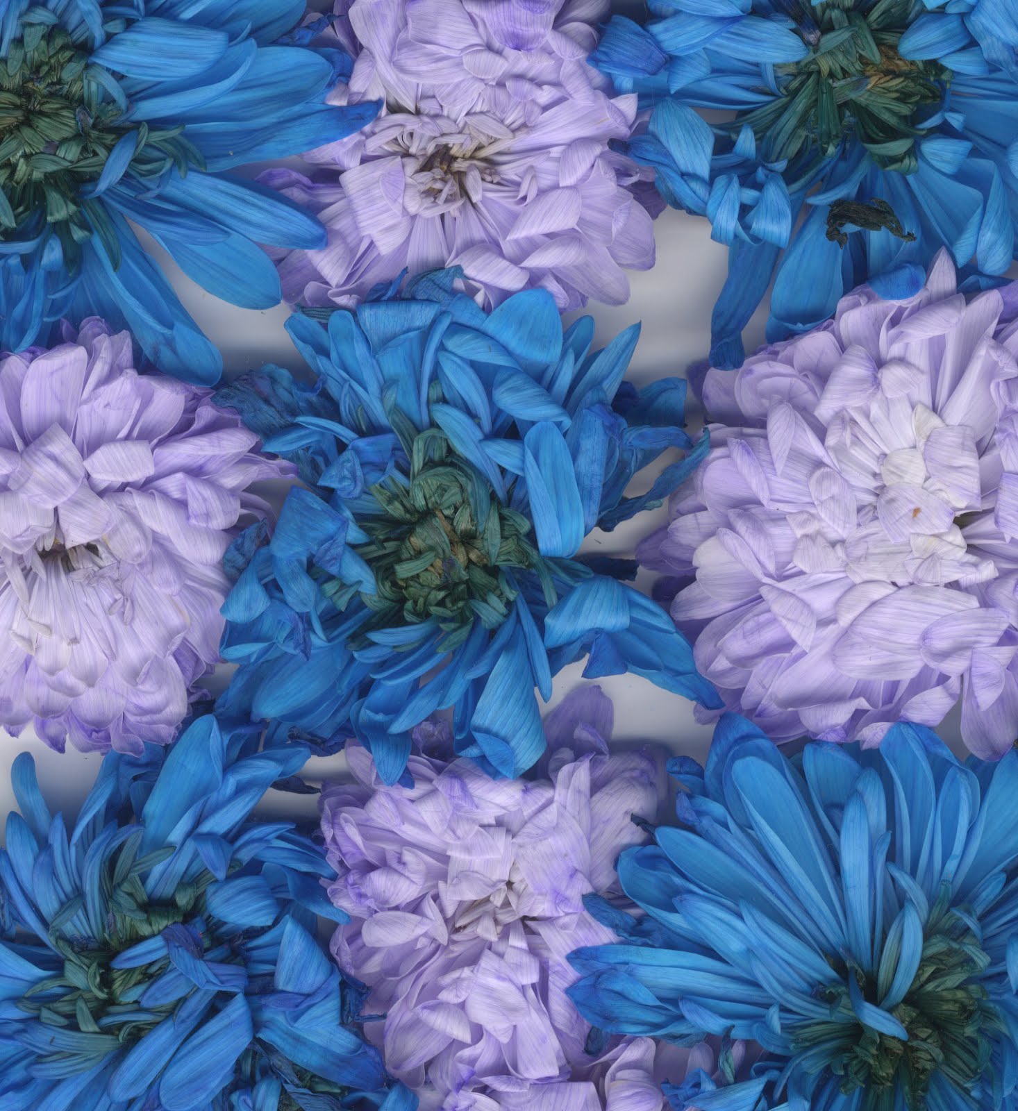


I then decided to go forward with the scanned and moved flowers and zoomed in on the outcomes so we could see how the scanner stretched out the colour to give it that electronic feel yet still keep it delicate to link to the artists voice. These designs look abstract and almost look like paintings which links back to my idea of creating something different to stand out in the submission. However I did like this these design I felt that they could do with being brighter just to make them look more positive. The idea of scanning also can link to the song lyrics and the positive and negative feeling due to the image being lighter and darker in certain places.


I then began with experimenting with the idea of making the images brighter and creating white space to link with the lyric 'Clearest blue'. These designs work well as they look electronic pop bank and also link with the lyrics however I felt that some of my other album cover ideas worked better.


These are some more experiments trying out different effects to make the album look brighter and more electronic/pop feel. In these albums I really like the way the colours look these album covers also look abstract and a bit like paintings.


I then decided to try the idea of illustration and created little illustrations of flowers as I felt maybe something simpler would work better. I used pencils and watercolour to create these illustrations sticking with the practical idea. I choose to do this type of drawing to show the delicacy of the artists voice. However i did feel that this type of repetitive pattern is often used in album covers so felt it might not be the best choice.

I then began to create a simpler design using white space to link with the word 'clearest' the space I feel makes the album cover easier to look at. This album looks different due to being an illustration and very pop & also in some ways alternative. But I felt that I could make this album cover even more simple.

From my previous experimentation i then created this image below keeping it simple as possible, using the negative space to link with the lyric 'clearest' but using the lyric 'blue' to influence the colour, but using the idea of the delicate flower to link with her voice. I feel that this album works well also & is my favourite due to the simplicity, however I do feel it lacks in an electronic feel but do feel it looks like a pop album cover.

The following images are mockups of the designs which I felt worked best for the artists/song i choose to create a cover for. I felt that each of these album covers had aspects of them worked really well, so I tried to combine some of them together using vinyl stickers to add more meaning to them like the one below, we can see the cover being very abstract and electronic yet the vinyl sticker is simple and clear like the song, yet is still abstract.


Overall I am pleased with my designs as through this experimentation i enjoyed creating them as, I used practical methods & felt most my outcomes looked attractive. I also feel that my final outcomes work well with linking to the song choice, due to the influence of the artists voice being delicate, the lyrics 'blue' & 'clearest' and the pop/electronic feels of the song and the methods used are practical and also abstract which makes them look different.
If I were to do this again I would experiment with different colours to make it not look as obvious & maybe using the electronic imagery to put into a flower shape which would might come up with a better final outcome.
During a crit I was giving positive feedback:
- Using flowers is original & abstract
- Don't think the word blue is needed
- Beautiful design
- Looks professional
- Re;axing outcomes
- Great designs all express the song really well
