For this project, I first began by searching photo books, art books and type books that designers have created. From this, I found that the designs of the book were sleek, modern & sophisticated.


I Then began to search binding methods of books
Binding Styles
- Spiral Wire Binding. The book is punched with a series of small holes on the left. ...
- Plastic Comb Binding. ...
- Saddle Stitch Binding. ...
- Side Stitched Binding. ...
- Case Bound (Section Sewing) ...
- Perfect Binding. ...
- Wire-O Binding or Double Wire Binding. ...
- Post Binding.


I then began to look at paper stocks and the thickness of the paper and how it would work being put into a book, trying to find the right paper is critical to designing a book as it can enhance a design.
To choose between the function and quality of a paper isn't easy. Sometimes you'll find a paper that you really want to work with, but in the end you realize that if you choose it, the production cost will go up significantly. This is usually just a concern when you work with a bigger production and need a lot of paper, then the price will escalate quickly. But even smaller projects can have problems with cost, especially if you choose unusual inks or post processing methods. So choosing a paper that's cheap, but still good for your product, can be tricky
Hard Back Book
Softback book

What's the difference?
Hardcover
A hardcover aka hardback is a book bound with the thick protective cover, with usually a paper or leather dust jacket over the main cover. The aim of a hardcover is protection and durability. These books are mainly for long-term use and collectors’ editions. Hardcover books last far longer than the corresponding paperbacks. They do not get damaged easily thus making them perfect for reference guides, great literary works, etc.
In addition, there is a difference in the type of paper used to print hardcover books. The paper used is the long-lasting acid-free type. Acid-free paper has a pH value of 7 (neutral) which makes it highly durable. The papers are stitched and glued to the spine.
Hardbacks are prepared for commercial works, best sellers, reference books, etc., which should be long lasting. If the market value of the book in question is high, publishers print out hardbacks first before paperbacks, since it is more profitable.
Paperback/Softcover
Paperback books are prepared for non-commercial works and those, which don’t get much exposure. The cover here is made of thinner paper or cardboard, with glue to stick to the leaves.
Since its cost of production is low, paperbacks are produced in mass, called mass market paperbacks. These are released after the hardcover edition is published. Usually, the paperbacks are sold in mass and are meant for short-term reads—that is, meant for people boarding airplanes, trains, etc.
Another type of paperback edition, known as trade paperback is created with more durable paper than mass market paperbacks.
For my topic of choice I decided to create a book based on Leeds bar/club/restaurant types which they use to brand and advertise their company, this book analysis the use of the fonts and logos in context with the places they are used, this book is aimed at art & photography students.
To begin my research I started roaming around Leeds with a camera taking photos of logos and typography, I also collaborated with a guy off photography who helped me take photos as I'm not talented with a camera. As I was taking them I noticed that a theme of neon lighting across a number of the images which I found particularly interesting. The use of the neon effect works well due to the fact it stands out and is eye catching. Another factor it that most of the fonts that are used are sans serif which appeals to students as sans-serif fonts tend to look modern.
Once I gathered my imagery we both sat down and began to edit some of the pictures trying to make the neon colors stand out and make them look more vibrant we did this by changing the hue and saturation using photoshop.


From gathering the photos I started to get an idea for a name for my book I wanted something that would describe nightlife but in a non obvious way, I wasn't getting far with ideas until I spoke to a family member who gave me the idea of calling the book Euphoria, I then started researching the name. Euphoria means a feeling or state of intense excitement and happiness. This related well to my subject due to the fact when you're on a night out in a night club you do feel happy and excited and the neon lighting of the logos also expresses this using the bright colors.
From there I then began to research fonts and typefaces that I could use, I wanted something quirky and a little alternative I had in mind and 80's look which I was looking for. After reading through books and searching online I found a sans serif typeface called excellent. I feel this type looks like an 80's nightclub typeface but also modern at the same time.

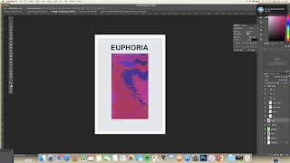
From this, I then began to create screen prints or patterns to create a euphoric ora but I also wanted to combine the element of being at a nightclub so wanted to create movement within the background. To help influence this idea i started to research euphoric imagery.


From this, I then began to combine the type and imagery together to start to come up with a front cover. From the research I've realized that if you're going to have bold imagery your better off having a simple design, as it'll be clearer and more professional to the reader. Beginning to design a cover I experimented with typefaces, effects, layout, tiring to figure out what colors would look best.


I then started to experiment more with the layout of the book and started to piece it together to get a better idea of how it would look, I started to add the photography imagery and place it in different ways and angles to get the best view. I also started to recreate some of the logo of the bars and pubs to place on the double page spread, however, I did find it a struggle I managed to recreate a couple, discovering this as a weakness gives me something to learn and work on.


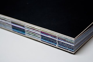
As the book was being put together I started to think of what book binding method I wanted it to be and if I wanted it hard back or soft back so to decide this I did some mockups of the book below and also did some examples of some binding methods. Due to this experiment, I decided that I would send it off and get it professionally made and also do some mockups myself to try to teach myself how to bind the books better. This book would be seen in a library underneath the typography section or in a specialist bookshop.
I really wanted to keep this book sleek and modern however, i do wish I experimented with embossing & foiling to add texture to the book
Overall I am happy with my final outcomes, I've enjoyed experimenting with type and learning about binding. However, if I was to do this again I would dedicate my time to the quality of the photos in this book and would also take more time consideration.


