From carrying out research through my dissertation, i found out the following; people prefer print to digitalized media, the reasons for this is because they find that print, is relaxing, they enjoy holding a physical object in their hands, and they enjoy the personal feel which comes with printed design as it gives a luxury feel, creating a memorable experience. Traditional print incorporates all five senses helping influence that personal touch to print that digital can’t. Not only have the findings proven people, prefer the personal touch to print, neuroscience has confirmed that people’s brains showed an emotional attachment to printed design’s also. Statistics have shown that people feel less stressed and drained having a publication in their hands.
Before researching into this dissertation, from personal opinions the thought of traditional print being a more popular medium was unlikely, however since researching into traditional the findings have presented otherwise, ultimately leaving a question for thought, ‘ Traditional print is becoming more successful everyday due to young talent, graduates, students and a technology which is placid in terms of the limit to experiment with ideas for this reason does it mean that, digital design is the dying art rather than traditional? Or have both mediums Juxtaposed?
To conclude, I’d like to leave this section with a quote that summarizes, how the senses connects to print as a whole, this quote is by a company called Choose print who are an educational company who use their website to promote the effectiveness of print.
“Print is wonderfully tactile. It’s a warm, friendly, emotional experience that no other medium can replicate. Which helps explain why print is so effective. A well-designed print piece can cut straight through the digital clutter to deliver a message that has resonance, impact and staying power. Humans were designed to touch and feel."
Overall, in order to keep up with the digital age we do need to take part of this digitisation process due to its vicious fast approaching technology, however it’s important that we combine traditional prints unique quality’s. Therefore, the answer is that both mediums should be combined to create, powerful, meaningful and unique design which touches the senses, ultimately creating a new medium and genre of art.
Because of these findings I decided to create a zine, which only used tradtional mediums. To help get even more inspiration I decided to look into my old college portfolio, as in college i used to work with a lot of tradtional mediums and i felt like i need to get the brain moving to think outside the box. From research I new that i didnt want to create something simple or complicated, I wanted it to be personal as from my dissertation i found, in the finings that people liked the personal feel of deisgns and tacticle feel and how it makes them feel relaxed.
One major influence which came to mind is Steven hellers, Typography sketch book which is a collection of different artists prosesses when creating typography. Its not often we get to see this from designers, we normally just see the final out come, but the process is far more interesting as the process is what gives the final its meaning and "aura".
These two images below is some experimentation carried out using screen print, this is one of the quotes that was in my essay, i wanted to keep the colour simple, as I wasnt sure what i was going to do with other mediums so wanted to keep the type simple and let the images speak for themselfs.

This image below is of a vinly cover I created for a previous project, using pencils I began to start to manipulte and see what i could do so that i could screen print it. I wanted to do this, because i wanted to incorporate as much tradtional methods of design in my zine as possible.

So in order to experiement with both digtial and tradtional because in my conclusion i said how both mediums should be mixed together, i started to digtialy create and experiment with a frunt cover. The pattern made is an imitation of brain waves when the brain is looking at physical advertising, i found this knowledge out from the neuroscience report in my dissertation.

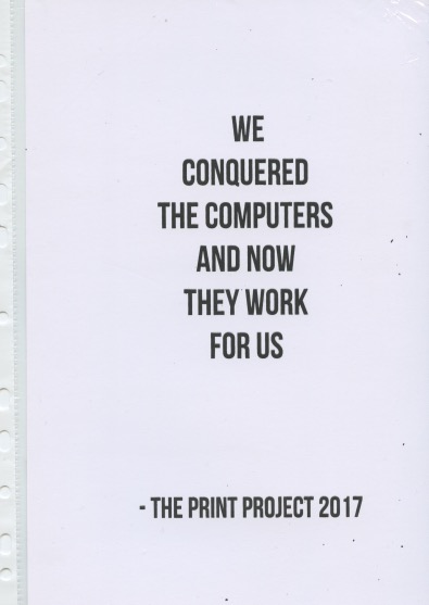
I then began another frunt cover design, keeping it simple, using sans serif font, this image is taking inspiration, from the books used for research frunt covers, which i found were using large bold text to make a statement. However I felt the lettering was to over powering due it's boldness and size.

I started to experiement with textures in the screen print room as from steven hellers book i foudn that the types that were most appealing used layers to create a textured look. This image also looks like chalk and could pass as a mix medium.

From steven hellers book I noticed that he was experiemtal with type. So for these images below i used masking tape for texture and smudge black paint and chalk to make the words actually look destroyed which works well, it's a very simple idea but has a big impact when you look at it.


If you revert yourself back to the top, you'll see how i created a digital version of this image below, however this image below is a sreen printed version. Personally this screen printed version is far more interesting than the one above. From knowledge gathered from research from books and my dissertation, I found that colour was often used, i found that i brightened up a design. I also found inmy dissertation how colour qualtity was differnt on a computer to tradtional print, print is more vibrant.
I then started experimenting with typography which i manipulated using digital prosessing photoshop and combined it by using tradtional print as in my conclusion, i found that the future of design should see both mediums combined together to be a successfull design. I used two different colours to creates this marbel effect, I purely did it just to see what it would look like and it worked out well. I then started creating a few differnt manipulations using screen print method, as I liked how experimental you could be.


This pattern below is an optical illusion created by using screen printing, I wanted this zine to be personal and experimental, my goal is to get the audiance to engage with this zine, by creating this optical illusion it makes peopl want to move it round as it creates a wave motion. The reason I want to get people to engage is because in my dissertation i found that the majoriy of people like the tactiltiy of print.
From understanding more into my essay, i also noticed another sensory people enjoyed when it came to print and thats the smell, so when i was mixing the screen printing ink, i mixed the smallest amout of perfume into the ink, so when it was screen printed, it would have an every lasting smell

Messing round wiht type i then started to play with type,the idea of this type was basically motivation to say to be scared of being different in the design world and to just do it and step out the box, as in my esssay i found that more designers needed to open minded in the design industry today.

This is some experimentation of me experimenting wiith a cover to hold the design toget, as research found that zines, these days come with some kind of wrap, but i found a lot of them are very simple and I wanted to do something different, so i screen printed a pattern on top of itself twice to create a 3d look it. This pattern in blue is the pattern i was editing at the start of the blue flowers, it actually came out sucess full and acts as a hold for the bottom of the zine.

This is the back of the zine, in which i created another multi layered design, i found inmy essay that layers means luxuary and so does paper stock, so i used watercolour paper, so it would create a two tone effect which you can see ever so slightly if you look closely.

I created a new version of the frunt cover being more experimentel with the colour combination, i wanted to exeperiment with more calming colurs and in my essay i found that people wanted to be relaxed when looking through a publication, so to do this i used purples and and blues, which created this monotone effect, which from feeback given from piers, they found it relaxing. The colours need to be relaxing also as the pattern on the frunt is quite intense when staring at it, so the colours balance this out.

This piece of work below took inspiration from david carsons work, this image says "i am human' the choice of these words comes inspired from my essay, in my essay one of the quotes found stated that, how digital on screen platforms takes us away from reality. This type is meant to communicate how digital media can make you feel, the letter forms symbolise confusion and stress, the words however remind you, of you being human, however they are hidden, like a puzzle and your mind has to figure out the messege. The reason for this is because concluding my essay i found that it was important to combine digital and traditonal print, and this experimentation does that.

I then started to put pages together to see what would work best where, I didnt want to put to much pattern in one place, otherwise it would make the reader dizzy.

From my research findings in Steven Hellers sketch book, i took inspiration of using physical objects to create type. This type is created using feathers, to make the word superking, like the cigaretts, as the buds of cigaretts are actually used by birds to make their nests. From research I also learnt that the audiance like to be able to feel textures in zines so i felt this would create a touch sensation for the audaince.

This image above is of some experiemental typography created using, screen printing using the same method, of mixing colours the colour combination here is black and pink, as i dont want the zine to be over powerful in colour on the inside.

This image below is of a quote i screen printed but spelt wrong so i made the decison to turn it into a collage using other bits of quotes from others that i spelt wrong and layered them on top of each other to create this multilayered concept.

This image above, i used marbelling to create the background and thentransfered it on to this thin material and layerd text over it, to create this 20's type. I wanted to incorporate as many mediums that were not digital as possible into this zine, to really show how much more interesting traditional methods can be. From this the images below I started to put the zine together.


This is something I experimented with, as i felt i needed the zine to look softer. Using flowers i used watercolour to create thi spainting and then scanned it in and layerd the same image over the top creating this two tone effect. Flowers are connected with nature and nature makes the majorty of people relaxed as it reminds you of fresh air. From research I found that it's important to incorporate all the senses do by doing this it creates a fresh feeling.

Overal I am pleased with my experiments, I've used different mediums such as; Screen printing, watercolour painting, mixing fragrance with paint, layering imagery, scanography and collage. This is relevent to my essay, as this zine is showing how print mediums can be tatctile and ignite the 5 senses just and create a luxury feel.
If I were to carry out this experimentation again, I would take more care with time managment so i would have more time to , experiment with a wider range of mediums and to create a larger zine. However I would of liked to make these improvements, I've enjoyed experimenting in this project.
No comments:
Post a Comment