To start off this assignment we both sat down and started to note down ideas of what kind of cards that we could create, so from this we began to research into the different card genres


Primary research:
Firstly I began by carrying out primary research into card shops such as clintons, and paper chase what was noted from these is that as soon as you walked in the shop the use of colour was highly popular. What was also noticed is that the cards were either blue or pink which separated the genders immediately.
Another factor which was noticed was that the colour influenced the target audience and that the shops had sections dedicated that seperated the type of cards which were being advertsied.


During the research we found that the cards had manly had illustrative designs which clustered the cards making them illegible to really see. Some of the designs and illustrations designs which made the cards look either immature or old, so there was no in between.
The research we carried out we found that cards and wrapping paper accessories lacked gender neutral options,, and were heavily image and illustration led. Cards that were aimed at emails commonly showed images of heart , cakes dresses and were usually in either at males typically had images of cards,beers,women, gardening and were commonly designed in blues and greens also with script fonts but were less delicate then the female cards as they were bold. From these findings we decided to trial the brief to being as gender neutral as possible to be as inclusive as possible
Genreal research


We then carried out research into more spercific genres of cards which were aimed and men and women and found the colours were either pink blue purple of black or used patterns such as floral, footballs, sports related, beauty related.
Due to these findings Katie thought that it would be an idea to create gender neutral cards because from are research that we found we found that there didn't seem to be a balance between the to, we also discussed that the influence of colour was not needed along with all the illustration, and during research found that type based cards seemed more unisex and open. It is because this reason we choose to experiment with the colour scheme of black, gold, and silver the reason for choosing this colour choice is because in research we found that colour was a major influence in the designs so we wanted neutral colours that weren't aimed at a particular sex.
Gold silver and black, are often related to a more mature theme but we thought we could adapt and change the form of text to make it look more modern and appealing.
Experimentation
Idea generation
To start the idea generation we designed a basic type composition that we then experimented with using traditional letterpress as we thought that this would create an aesthetically pleasing result. However because of the composition of the type we struggles to achieve the aesthetic we were looking for.
After experimenting with letterpress we decided to develop the composition further as we felt that the letters did not connect.


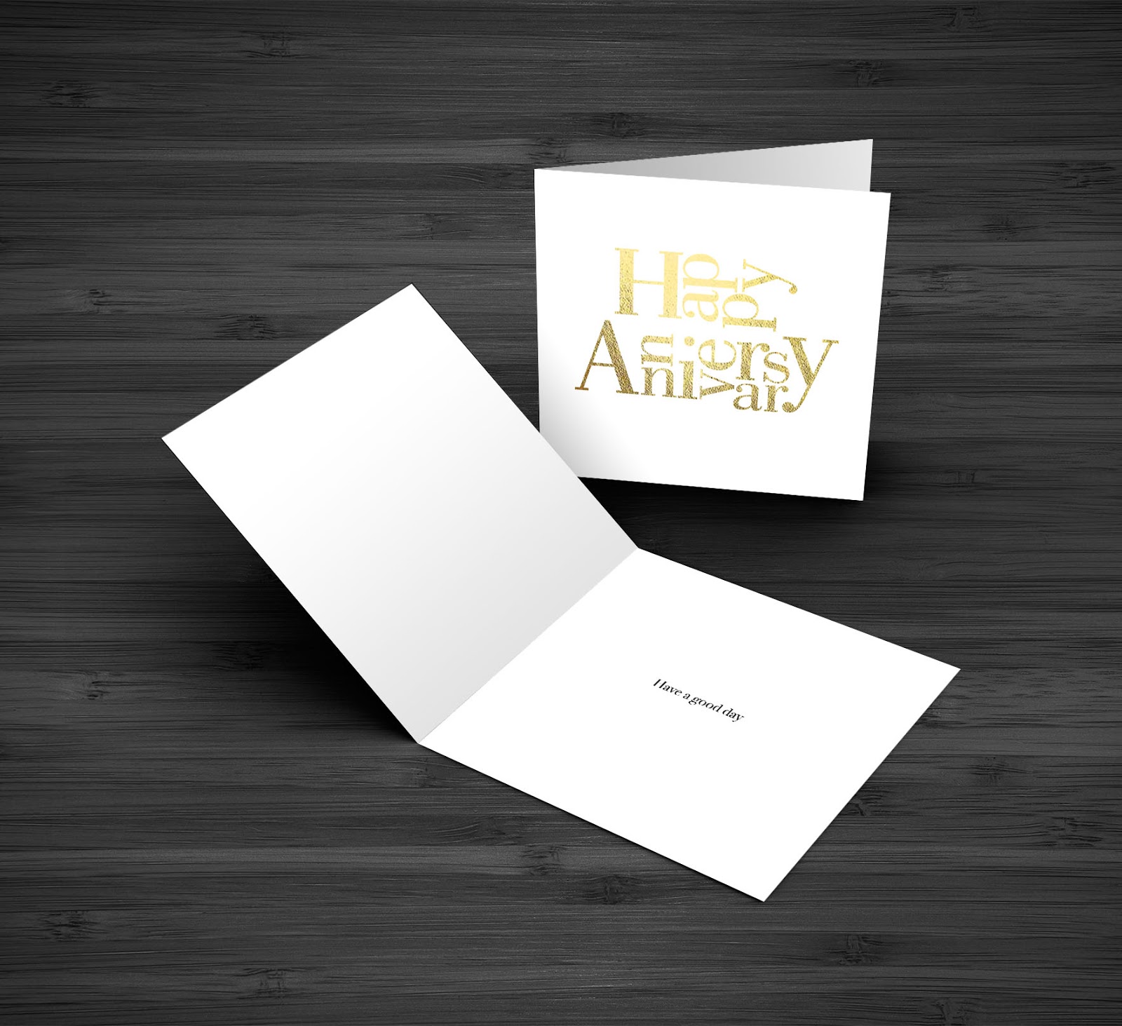
When designing we kept in mind the research we found and decided that including images and illustration limited the audience, so we decided that we would create a card range that used interesting type composition in replace of imagery. This left the intended audience open as it was not designed with a specific gender in mind, but would be designed to be given to anyone from anyone, we decided that the concept should not be limited to one occasion but be open to multiple occasions such as birthdays, congratulations, happy anniversary and thank you.
From this we began to experiment with Bodoni font, as its known for its classy effect so we began by experimenting, creating wrapping paper, & card designers. What we found through experimenting with this font is that the font looked to girly and designers and is something you'd see in a designer store and we really wanted to try and avoid aiming it in a target audience. It is because of this reason that they didn't work.
Feedback
During uni we had a crit, following this crit we had a wide range of feedback:
- Using metallics is a Great idea
- Gender neutral is a good idea
- Don't limit the colour choice because of gender
Colour combinations
From idea generation, we discovered a composition that worked well for each occasion. Following this we then experimented with colour of the collection as we found colour is an important element which determine the target audience. Because of this we decided to use gender associated colours as we didn't want to confirm stereotypes. When Receiving feedback from this concept it was discussed that the aesthetic was that of luxury feel because of his we decided to use metallic colours as ordinary colours would not convey this aesthetic
It is because of this feedback that we then decided to look at other colours such as blue pinks and greens as in feedback found we found that we should include colours as not all colours indicate a sex.

Colour combinations
To carry out this we started to create colour combinations using purple and and blue the reason for this choice is because they are similar to each-other and these colours are used more than others when it comes to gender neutral cards.


I then created a survey to find out what customers wanted in a card and what they thought would be appropriate and it was alarming to note that people didn't think that there were gender neutral cards and agreed that they should be type based. From this research it will influence the future designs .
From gaing this knowlege katie began to manipulate the font to make it look more gender neutral by making the serfs larger and this idea worked in its favour creating a more appropriate card design.


Katie then started to put together smoother type compositions which we both sat down and talked about to evaluate what to change and what not to change. All we decided to do was to move a few letters round so the fit in the concept in a more satisfying way.


Final outcomes: Mockups
Following on from research and are idea generation we found developments which we found we re most appropriate response to the brief and out intended concept. We used a combination of interesting composition and metallic colours to reflect a luxury feel. To reflect this we used a serif font which was adapted to make it more suitable and gender Neutral as we found bold strokes were to masculine, and thin strokes were to feminine Our typeface is a balance between the two. Overall out collection type fits together perfectly creating a seamless design which is complimented by the colour combination.
From these design I then began to create mockups for are finals, we knew that these needed to be professional as possible as this brief was a live brief which was interesting to do. Through the experimentation carried out we decided to go with the use of purple and blue colours and use the thicker font and compositions which Katie created. This project has been particularly stressful as it is always hard working in a group for the first couple of times. However from this experience I have learnt a lot from Katie when it comes to letter pressing and type composition.
If i were to do this again I would have definitely involve myself more I'm very disappointed with the little in this project which i did even tho i felt i did a lot in comparison to Katie I did not. We both had good communications but at times could not meet up due to these issues so Katie in her own time created more work, which is what i should of done to and pushed myself. Overall I have enjoyed this experience and if I was to do this again I would make a lot more effort.
As final outcomes i think that these design work well due to taking into consideration or primary research carrying out surveys and findings from the public who agreed that gender cards were needed and feedback from are peers indicated that the cards and accessories we created worked well as a gender neutral outcomes altogether.


No comments:
Post a Comment