
This was a project which i was asked to do by a fitness proffeshional
Stephen Bronze, he was looking for self branding in a short amount of time, due to this request I decided to move straight to experimentation digitaly, this was a task for me to work with short time scale and work on my proffeshional skills in a quick manner. A vonerability which I was nervious for was, the fitness logo itself due to the fact that I find it difficult to create logos and it take me a while to genereate ideas so this assighnment was a learning curve for me.
Stephen Bronze, he was looking for self branding in a short amount of time, due to this request I decided to move straight to experimentation digitaly, this was a task for me to work with short time scale and work on my proffeshional skills in a quick manner. A vonerability which I was nervious for was, the fitness logo itself due to the fact that I find it difficult to create logos and it take me a while to genereate ideas so this assighnment was a learning curve for me.
Through discussion with the client he had already changed his mind about being called pheonix as his changed the concept of his branding, he wanted his logo to be completely open, using his anitials.
However what made this brief easier is the fact the client new what he wanted, through experiance for working for clients I've found it difficult to get information out of custmers which in result hasnt resulted in my best performance work.
Concept: Self branding, which uses the colour choices of either black,white,red or blue with a sans serif bold font, would prefer a font which is type based. This concept was fairly open which made it very easy to adapt and create in a short amount of time (A week) which included the printing of buisness cards foiled to.
To begin with digital experimentation I began by using illustrator to create variations of mono grams in various differnt colours, due to the theme being sports related I didnt want to make it look to much like other sports logos, so took inspiration from letter forms that looked like poses a fitness model poses with. We can se this with the first row of the logos wherethe letter s has a log bar at the top which symbolises the arms turning inside, the idea of all these letters joined is meant to show strength which realtes to the font choice which is big and bold just like the client.
From discussion with the client the asked if i could try incorporate colours, so I started this by including gradiants and then increasing this more by adding the colour red. Red is a colour of strength and when used with black it gives a masculine feel to it, the same concept comes from dark colours such as navy and grey. 
From sending him the first set of experiments above, he asked if I would create some logos which looks more fancy and less casual. Approaching this I was worried as the imagery which I was getting sent from him was serif fonts, which you would not often see used in fitness logos and as a desinger I'm stubben like many others and find it difficult to carry out something we dont agree with, but as a designer we have to carry out work that we dont agree with sometimes.
To carry out this task I started experimenting with the font Bodoni known for its boldness and profeshional look, bodoni is used for many brands today, we often see this font in designer shops. I sent him images of the process which i was going through and he liked the font choicr and as I was working on it i started to like it myself more also.
From this below I started to experiment further with this idea trying to think of mature colour schemes but also colour schemes that would be transferable to clothing, & webistes etc so I used the colour black and white which are basic but look profeshional and its easy to add and take away more ideas. From what I was sending over I could immediately tell he was more interested in the more elegant looking cards, so because of this I introduced him to foiling and screen printing and having this as an open option.

To help introduce the copper idea, I began by creating a new logo, from what i could gather he wanted something simple elegant but not to formal, so for his idea, I created outlines for his logo rather than bold fill colour as it looked over the top. I then layerd the same logo over the top in gold foil which creates this high class to them, however because the font is serif and rounded it balances out the foil looks so looks elegant without looking over the top and fancy

From this the Stephen really liked the design and asked if I'd do some mockups so mocked them up on buisness cards.
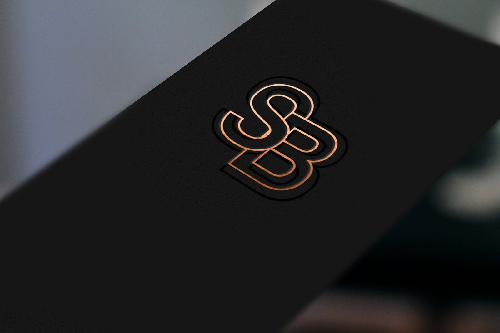


From feedback for my client, he decided that he really liked the copper foiling, but to make sure he was sure, I created an extra few logo design so he had the option and I didnt want him to rush into something considering it had only happened all in one day.
This time i started incorporating patterns into the logo as he had mentioned that he likes the idea of black and black , so i began to create optical illusions to crete this effect, again keeping it type based. The client was very pleased with the outcomes which I had created for him, and choose to go with the copper foiling buisness cards.
This brief carried out over a week and was very fast paced, it's challanged my time management and challanged my stress levels most definately. What I also found difficult was that everything i sent him he said he liked so it took a long time to narrow down which logos we were going to develop or change, however I did enjoy working with him. From self branding him I've now been asked to advertise and promote a chairty event which He will be carrying out in roundhay in August.
This project was probebly one of the most stressfull project that I've carried out because of my weakness in sports related branding as i've never been particulaly good at it, and logo design genreally i've always struggled with. Time scale is a huge scale for me also as I often leave things last minute but because of the short notice of this brief I've had to plan everything I do for this brief. Whats made this brief difficult is not having time to research into logos porperly however it wasnt a huge issue due to carrying out branding briefs before, however personally myself i can see the lack of research in this brief and how its effected the final outcomes even though they look good.
Through doing this I have however made a contact who has now advertised me as designer to other fitness groups and models and from this networking oppertunties have been constantly coming up, which is helping me get my work out there and is helping me get confidence as a designer.
No comments:
Post a Comment