Josef Albers
For my leaflet design I decided that I wanted to base it round an artists called Josef Albers, who is a colour theory artist, the leaflet that I will be creating will be based on colour theory and it will be simplistic.

In visual perception a color is almost never seen as it really is — as it physically is. This fact makes color the most relative medium in art.In order to use color effectively it is necessary to recognize that color deceives continually. To this end, the beginning is not a study of color systems.First, it should be learned that one and the same color evokes innumerable readings. Instead of mechanically applying or merely implying laws and rules of color harmony, distinct color effects are produced-through recognition of the interaction of color-by making, for instance, two very different colors look alike, or nearly alike.

Albers defied the standard academic approach of “theory and practice,” focusing instead on “development of observation and articulation,” with an emphasis not only on seeing color, but also feeling the relationships between colors. He writes:
[Interaction of Color] reverses this order and places practice before theory, which after all, is the conclusion of practice. … Just as the knowledge of acoustics does not make one musical — neither on the productive nor on the appreciative side — so no color system by itself can develop one’s sensitivity for color. This is parallel to the recognition that no theory of composition by itself leads to the production of music, or of art.Practical exercises demonstrate through color deception (illusion) the relativity and instability of color. And experience teaches that in visual perception there is a discrepancy between physical fact and psychic effect. What counts here — first and last — is not so-called knowledge of so-called facts, but vision — seeing. Seeing here implies Schauen (as in Weltanschauung) and is coupled with fantasy, with imagination.

The ‘afterimage effect’ demonstrates the interaction of color caused by interdependence of color: On the left are yellow circles of equal diameter which touch each other and fill out a white square. There is a black dot in its center. On the right is an empty white square, also with a centered black dot. Each is on a black background. After staring for half a minute at the left square, shift the focus suddenly to the right square. Instead of the usual color-based afterimage that would complement the yellow circles with blue, their opposite, a shape-based afterimage is manifest as diamond shapes — the ‘leftover’ of the circles — are seen in yellow. This illusion double, reversed afterimage is sometimes called contrast reversal.
 Color is constantly changing. Color is always being seen in relation to the colors it surrounded by. It is almost impossible to see a color by itself and not interacting with its sorroundings. For instance the green in the following diagram appears as two very different shades of green even though both of the squares are the same shade of green. The green is interacting with the backgrounds it has been placed on. The reason the green appears so different on each background is that each color influences the green differently. The following exercises will help demonstrate how color is decieving and susceptible to its surroundings.
 Color is understood through experience. We need to train our eyes to understand color and begin to see the differences between colors. Through comparison and contrast of different colors one begins to understand how colors interact and how to apply this to color usage.
Synopsis
Josef Albers was instrumental in bringing the tenets of European modernism, particularly those associated with the Bauhaus, to America. His legacy as a teacher of artists, as well as his extensive theoretical work proposing that color, rather than form, is the primary medium of pictorial language, profoundly influenced the development of modern art in the United States during the 1950s and 1960s.
Key Ideas
Albers's 1963 book Interaction of Color provided the most comprehensive analysis of the function and perception of color to date and profoundly influenced art education and artistic practice, especially Color Field painting and Minimalism, in the twentieth century.
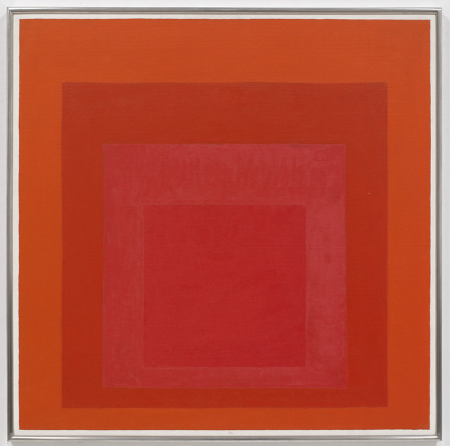
His series Homage to the Square, produced from 1949 until his death, used a single geometric shape to systematically explore the vast range of visual effects that could be achieved through color and spatial relationships alone.
Albers's art and theories were widely disseminated to generations of artists and art-school faculty through his teachings at the Bauhaus, Black Mountain College, and Yale University, and they provided the theoretical basis for the development of non-objective art during and after the age of Abstract Expressionism.
Most Important Art
 |
Homage to the Square: Dissolving/Vanishing (1951)
Homage to the Square is the signature series of over 1000 related works, which Albers began in 1949 and continued to develop until his death in 1976. Such sustained attention to a single aspect of painting reflects his conviction that insight is only attained through "continued trying and critical repetition." This early work exemplifies his basic approach to exploring the mutability of human perception and the range of optical and psychological effects that colors alone can produce depending on their position and proximity. Albers chose a single, repeated geometric shape, which he insisted was devoid of symbolism, to systematically experiment with the "relativity" of color, how it changes through juxtaposition, placement, and interaction with other colors, generating the illusion of attraction, resistance, weight, and movement. As in his earlier monochromatic and linear studies, this series explores the potential of static two-dimensional media to invoke dynamic three-dimensional space.
Oil on Masonite - Los Angeles County Museum of Art
|


In 1950, at the age of 62, Albers began what would become his signature series, the Homage to the Square. Over the next 26 years, until his death in 1976, he produced hundreds of variations on the basic compositional scheme of three or four squares set inside each other, with the squares slightly gravitating towards the bottom edge. What may at first appear to be a very narrow conceptual framework reveals itself as one of extraordinary perceptual complexity. In 1965, he wrote of the series: ‘They all are of different palettes, and, therefore, so to speak, of different climates. Choice of the colours used, as well as their order, is aimed at an interaction - influencing and changing each other forth and back. Thus, character and feeling alter from painting to painting without any additional ‘hand writing’ or, so-called, texture. Though the underlying symmetrical and quasi-concentric order of squares remains the same in all paintings – in proportion and placement – these same squares group or single themselves, connect and separate in many different ways.’


This is the leaflet I created using Josef Albers imagery, the leaflet is a simple half fold which I choose as I wanted to keep it simple the design of the leaflet is basic as I feel the use of the white space in contrast with the vibrant imagery works well because it balances it out.
I enjoyed creating this leaflet as i found it very interesting researching into Josef Albers theory behind the use of colour as it has also made myself think of colour theory in a different perspective.
If i were to do this again I would take more time and care to create this leaflet to make it more interesting and to have more information in it also.


No comments:
Post a Comment